The metrics at the top give you the results based on all 1,000 scenarios (search stochastic within our Knowledge Base for further information on stochastic modelling).
 Underneath this are four graphs (shown within 2 tabs) two for Expenses and two for Assets.
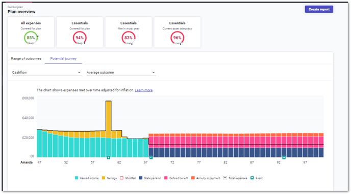
The first graph shows the range of results from the 1000 scenarios for the client’s expense being met. By clicking on the ‘Potential journey’ tab, the Cashflow graph shows only one scenario as an example, which is the median result.
In the scenario above, the client’s expenses have been met every year in this median result. As such, the presentation of the graph may differ from the summary results above.