A thousand scenarios of annual investment returns are run in order to create the forecast results.
The diamond images in the chart represent the range of possible outcomes by their height, and the likelihood by their width.
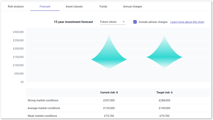
The most likely, middle outcomes, are therefore at the widest point of the diamond. The Strong result is based on the 950th scenario, the Average result is based on the 500th scenario and the Weak result is based on the 50th scenario.
The forecasts include only 90% of the outcomes generated - the best 5% and the worst 5% are excluded from the forecasts.