We run a forecast for each product individually and for the combined set of products also. This forecast provides a mean return over the period in question and also the volatility. We use a measure of volatility that looks at the standard deviation of the results at the end of the term which is aligned with what the client is exposed to. This, therefore, represents either the spending power or the fund value that they will have at the end of the term.
We then plot the mean return and the volatility figures on the graph. Since you need to take increasing amounts of risk to gain a better return, the gaps between the risk profiles also increase as the risk increases.
Each risk profile has a target area that increases in width as the risk increases since there is a need to take increasing amounts of risk to get the same amount of additional return.
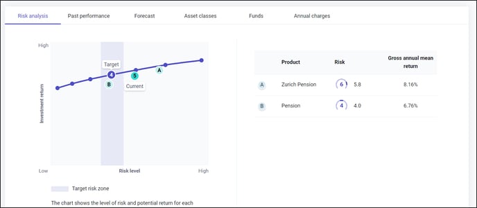
The target areas are shown with the risk profile in the middle of the risk area, halfway between the category above and below.
This central location of the target in the middle of the risk profile is important as it means that it avoids the situation where a slight change in risk from the target would mean you’re in the next profile along.
